My Role
I was the lead UI / UX designer for the TimeTracker B2B web application. TimeTracker is a time tracking and record keeping web service for small to medium sized businesses.
Our team designed several features for the TimeTracker service and worked on all platforms it was offered on (i.e. mobile, tablet, desktop widget, …).
Here, I will highlight some of the complex features and design challenges.
New Feature: Sync time data with third party apps
TimeTracker customers wanted to sync their employees time data with third party services like QuickBooks, Zen Payroll, Xero, etc… They use these third party apps for doing their taxes, payroll, or invoicing (services that TimeTracker does not offer) for their business. This was an essential feature that would keep customer retention and was an excellent selling point for new customers.
The problems to solve:
- Users want to synchronize their employee’s time data with 3rd party services (i.e. Quickbooks/Xero for accounting, Concur for invoicing, …)
- Users want all employee time data in TimeTracker to be consistent with time data in other 3rd party apps
- How do users sync inconsistent time data between TimeTracker and 3rd party apps
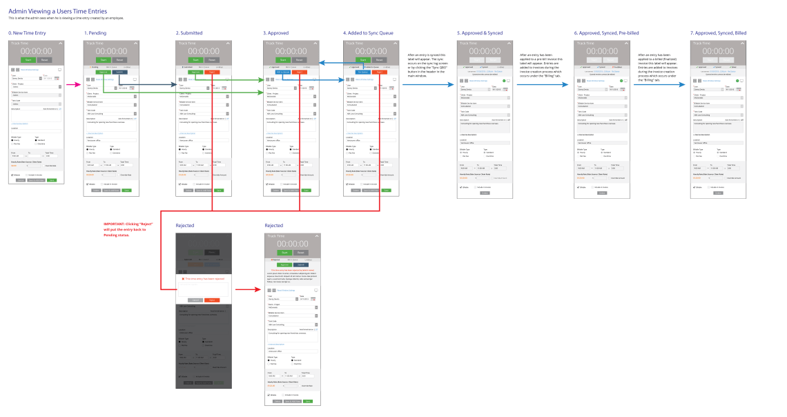
- The sync process must fit with the TimeTracker approval and billing processes
Starting with a User Journey
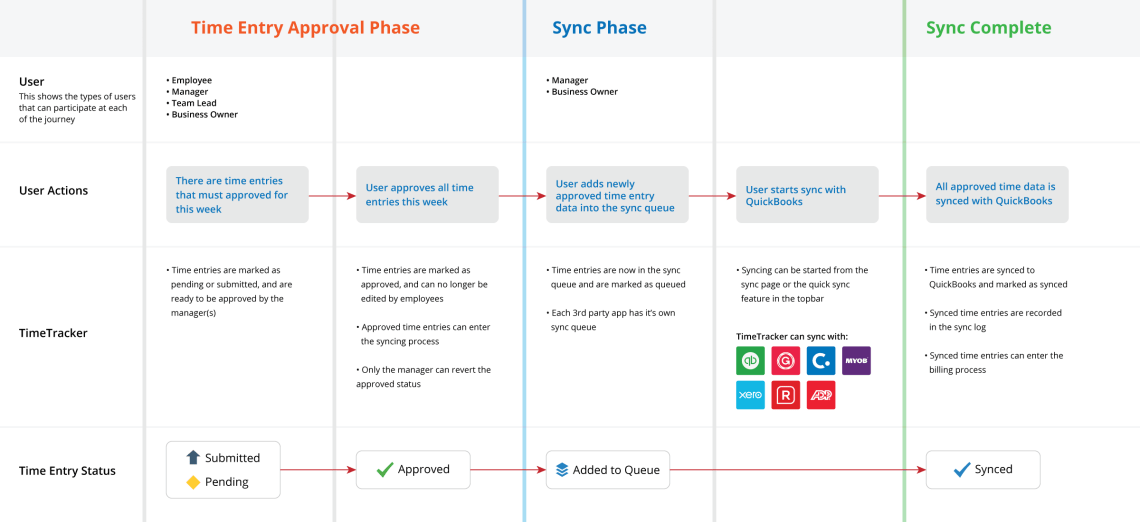
I created a user journey to illustrate the process that a TimeTracker user would go through to sync their employee’s time data with a third party app. This journey accounts for the already established TimeTracker process for entering and approving employee time data and shows how the syncing process fits in.
Detailing with Flow Charts
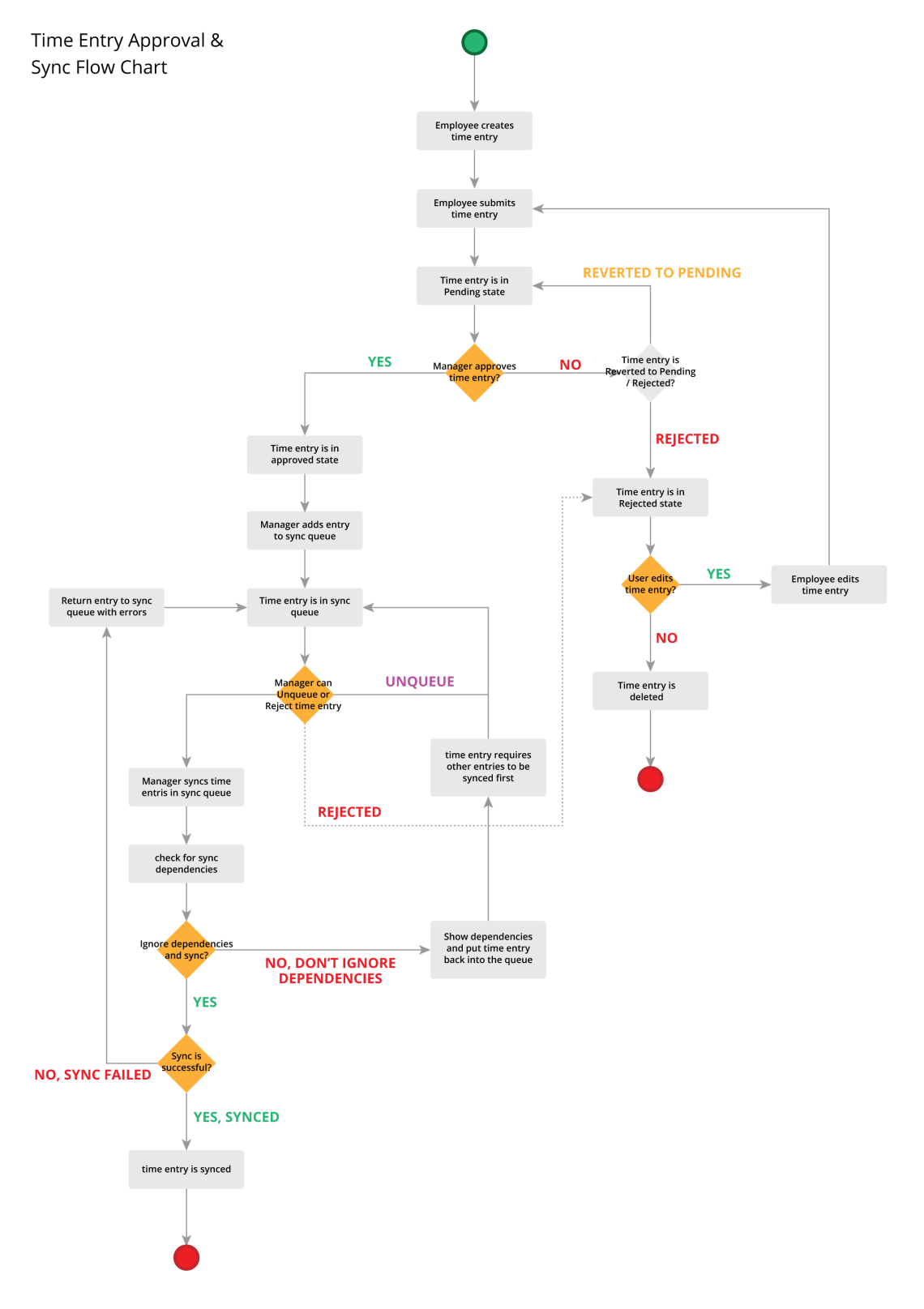
Next, I drew out a flow chart describing the time entry approval and sync flow involving both the employee and manager. Also, I included the error cases (i.e. manager rejects employee time entry or the sync failed) that would occur.
Final Designs
Re-Design: New Time Entry Form
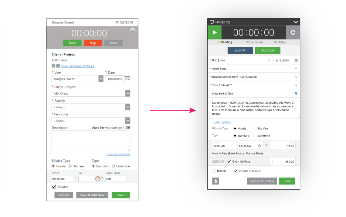
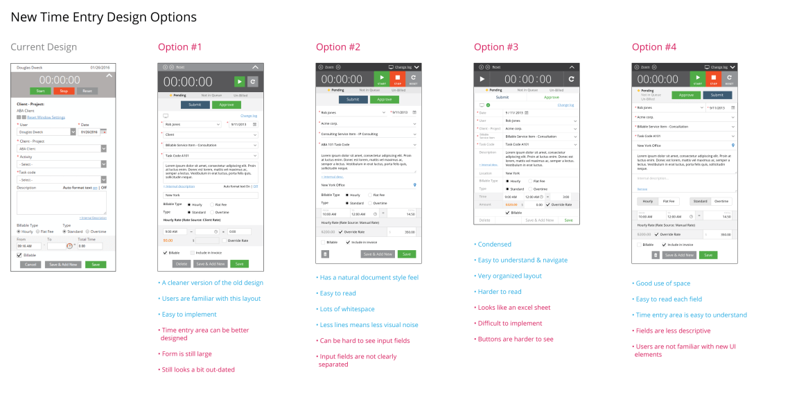
The existing time entry pop-up design was becoming dated and crowded with all the new fields and features that were added over the last two years. The challenge was to redesign the time entry pop-up so that it was easier to understand and use for TimeTracker users.
The problems to solve:
- Time entry form is too large and has too many input fields
- There are unnecessary UI elements (i.e. Reset Window Settings)
- It is hard to read at times
- The visual design looks outdated
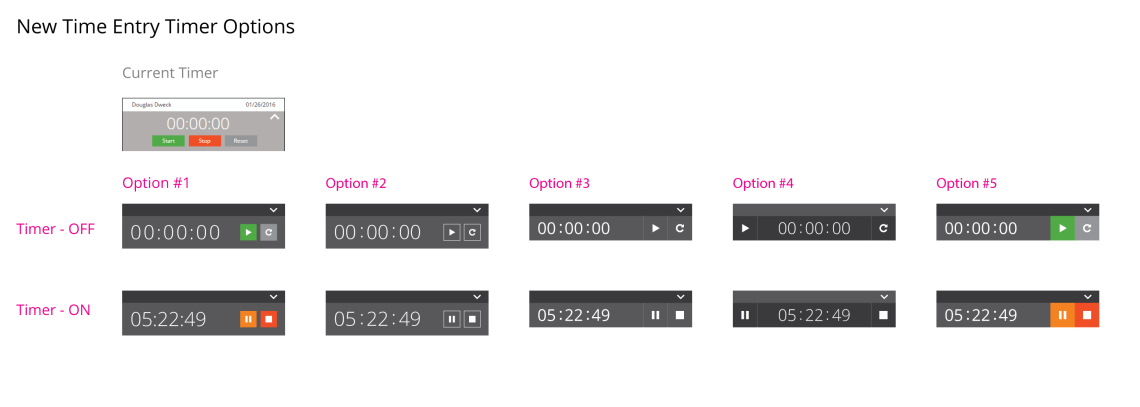
- The timer is too big and outdated
Creating new ideas
We explored several different redesigns for the time entry form using different layout styles. Each design had its merits and faults.
Also, we explored different designs for the timer.
Final Designs
To help with our decision making we focused on a few main goals that we wanted the time entry form to achieve:
- Easy for users to read & understand
- Easy for users to input data & use the timer
- Form must be concise
These goals guided our decision making to selectively include and exclude specific UI elements that worked and didn’t work from the batch of redesigns. In the end, the final design became a combination of all theses different ideas (some slightly modified).
