My Role
I worked with another designer, a project manager, and our client on UX planning and UI design. We planned the website hierarchy and all the features together. Me and the other designer worked together to create wireframes and final designs.
The Challenge
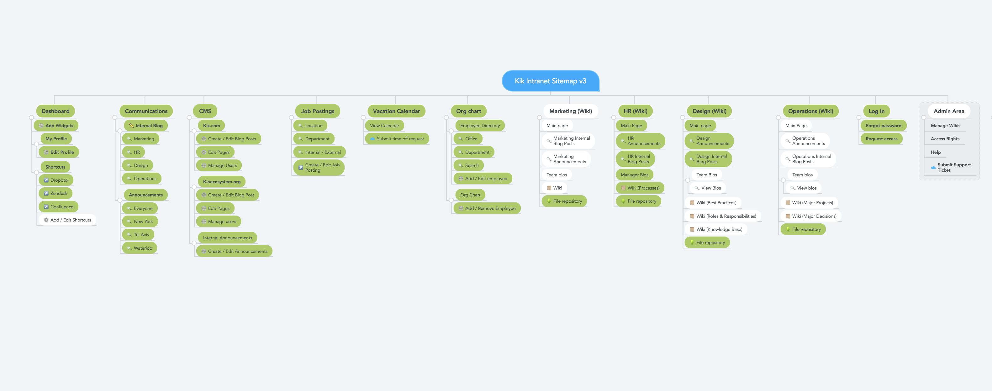
Kik requested us to design and build a company intranet for their employees, where they could stay up-to-date with company news and announcements and have access to company assets and resources.
What did the client want:
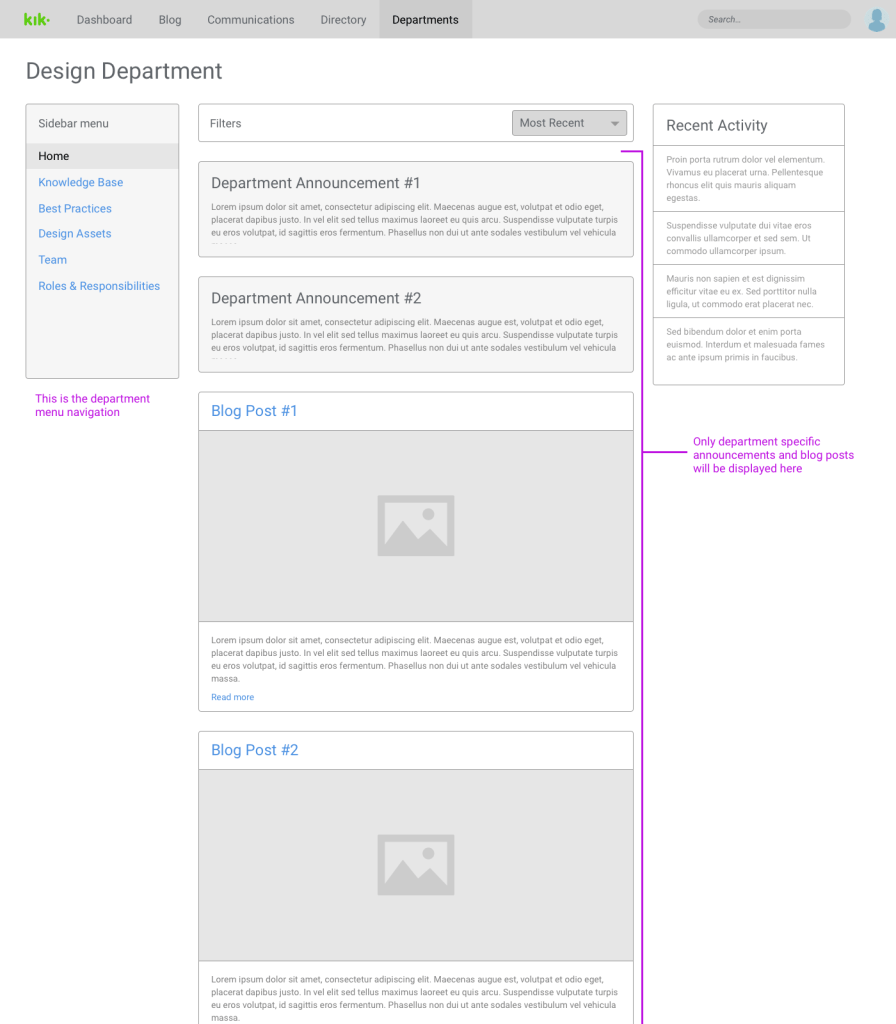
- An internal blog of company news and announcements, separated by departments
- Wikis for each department that contain documents and resources
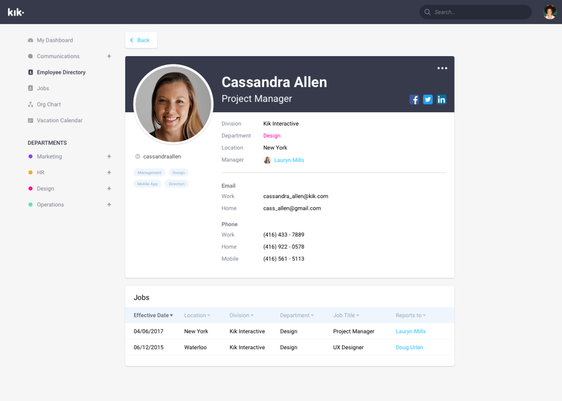
- List of employees and their profiles
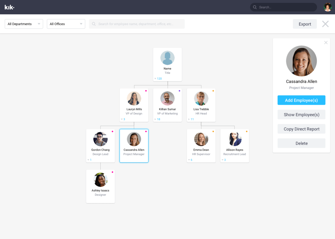
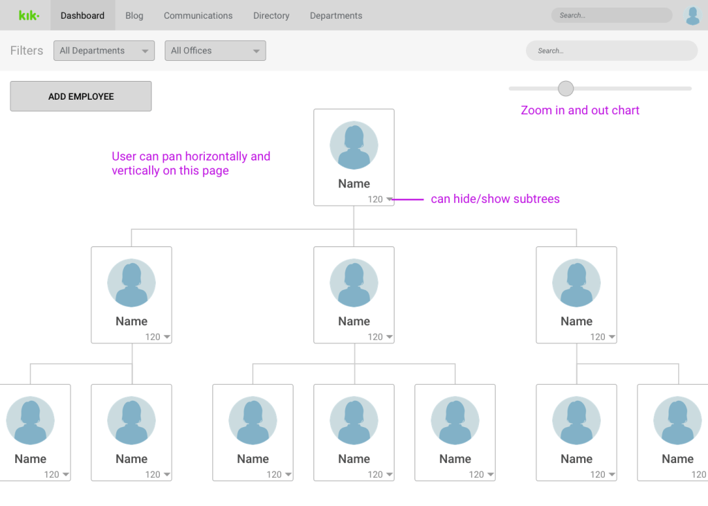
- A company organization chart
The Approach
After discussing with the client about the specific features they wanted, we compiled a list of all the features and ordered them by priority. During the design phase, our client would make additional requests and changes, and the list of features would change.
Final Feature List:
- View important company announcements and updates
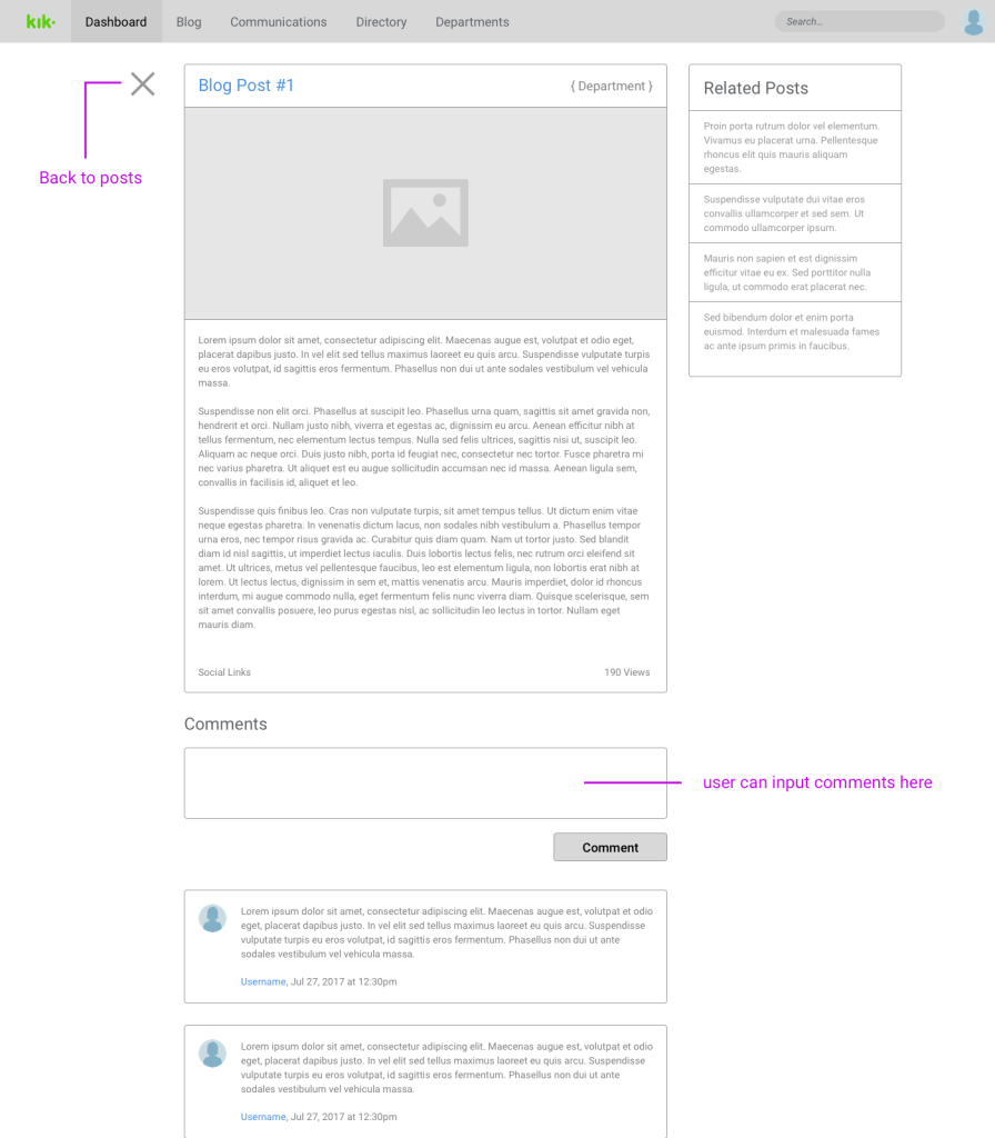
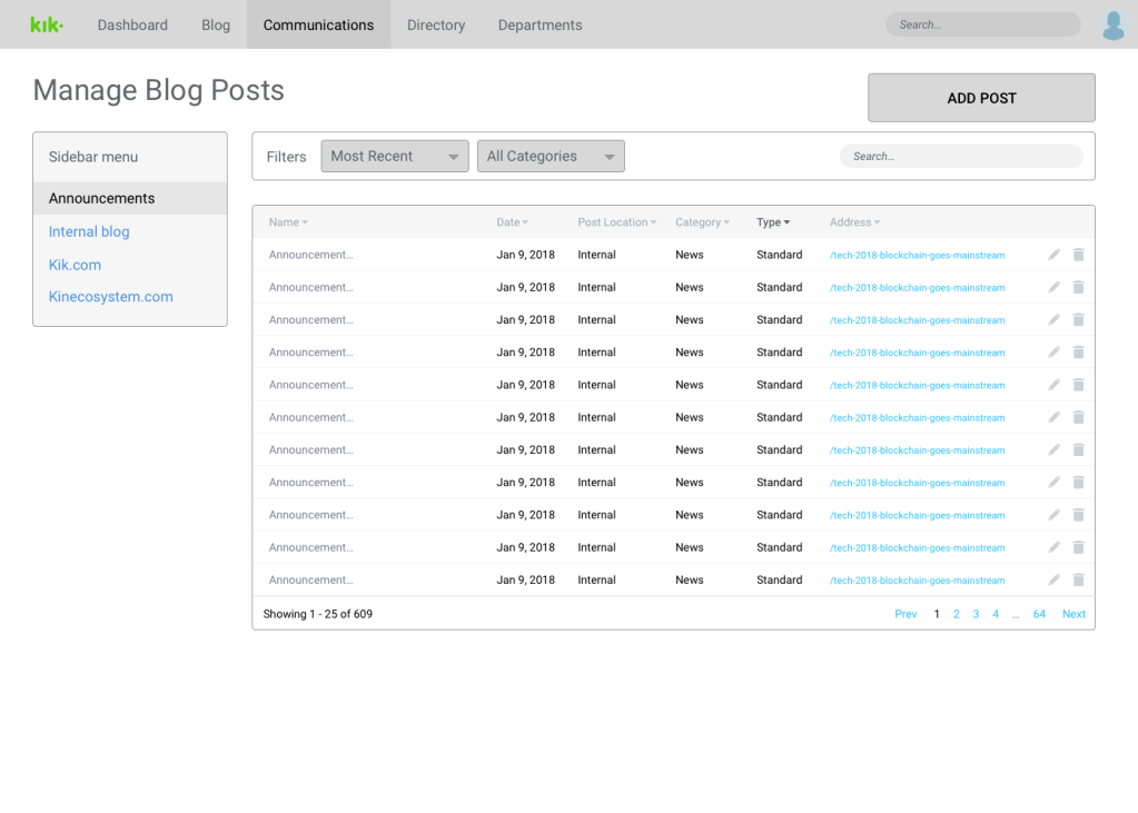
- Have an internal company blog
- HR can create and edit external and internal blog posts
- A company wiki to store documents, resources, and assets for each department
- Users can view and search company employees
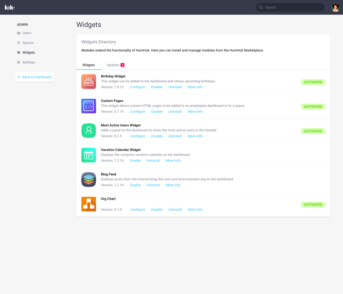
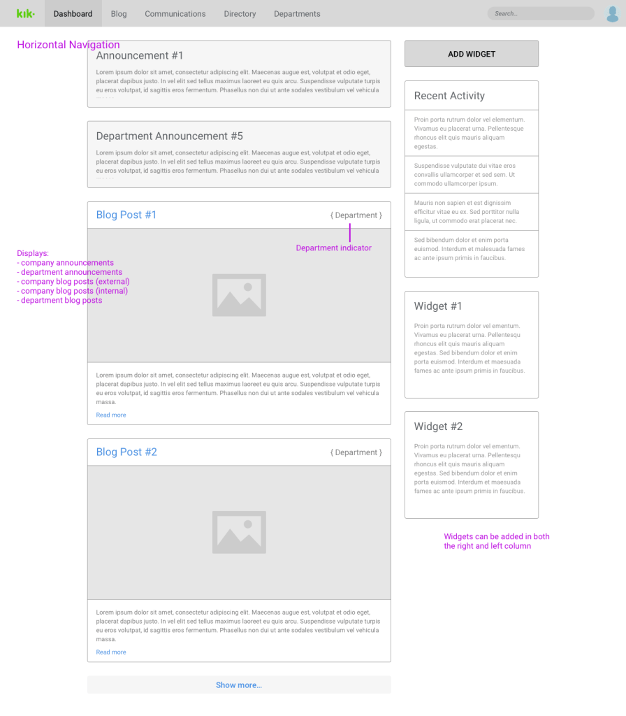
- Users can customize their dashboard (i.e. adding widgets)
- HR can create and edit job postings
- An employee vacation calendar
UX planning
With the main features settled, we were able to have deeper discussions on the specific implementation of these features and how the whole intranet would work as a whole. Here are some of the UX issues that came up during planning:
- How should all the pages be organized in a hierarchy?
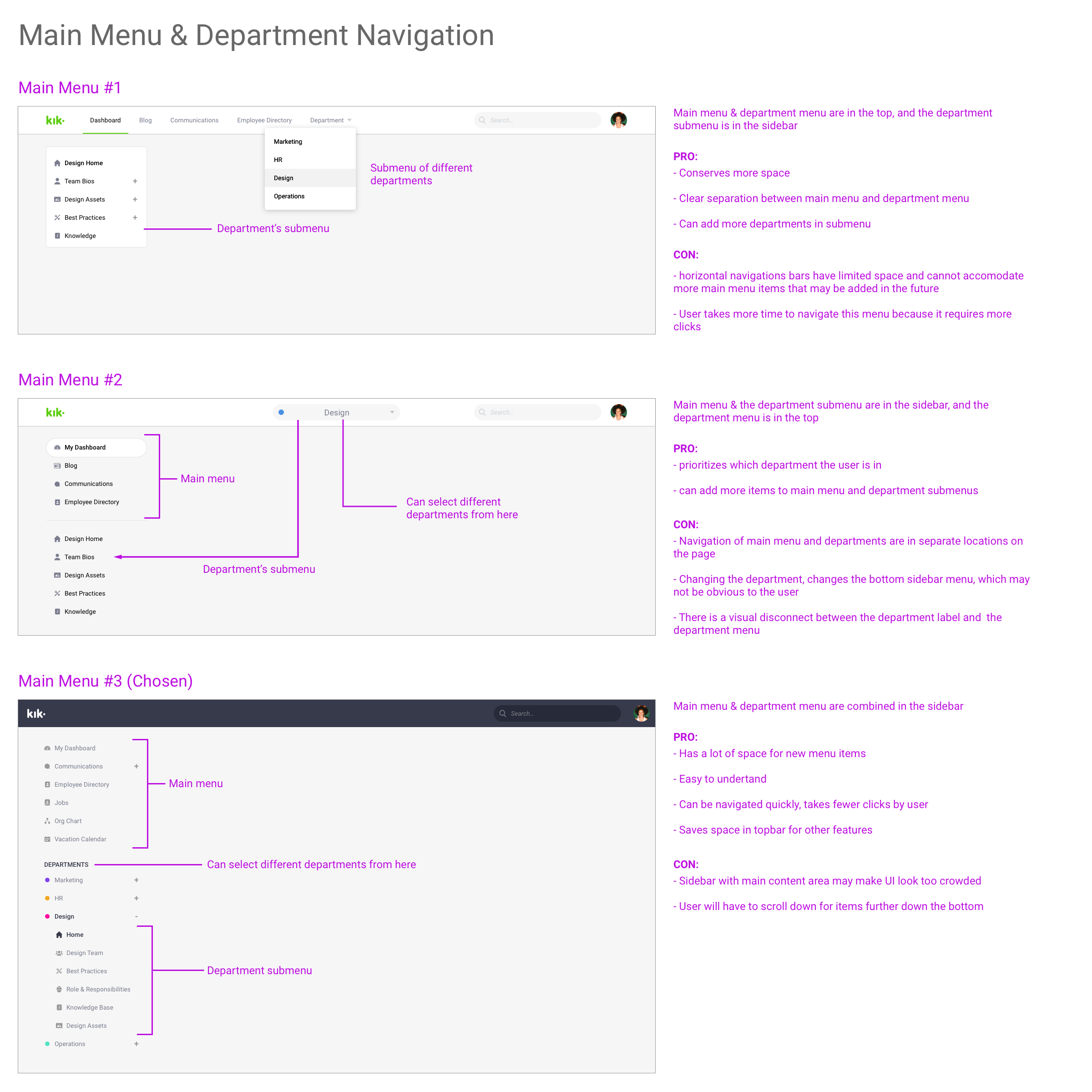
- For the main navigation: horizontal vs vertical navigation?
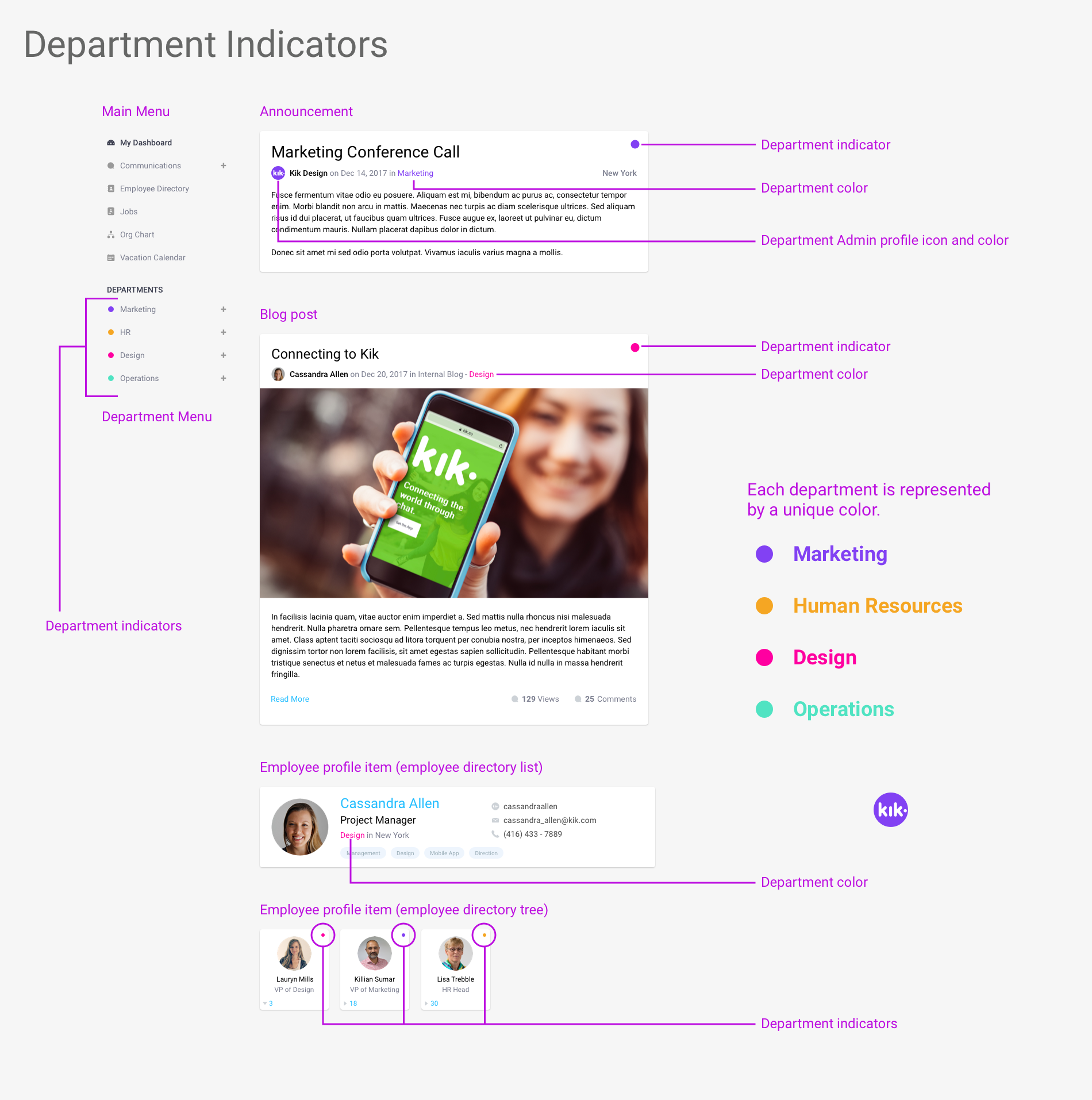
- How do users know which piece of information (i.e. announcements, blog posts, etc…) are from which departments?
- How will the UI accommodate future extensions (i.e. new departments, new wiki features, …)
- How do we make search easy and fast?
- How do we separate global company information/resources from department information/resources?
Making the sitemap
We created a user persona to help inform the design of the service and set the tone of the experience. I always returned to this archetype to help with my design decisions.
Some Specific Challenges
Vertical vs horizontal navigation?
We chose the vertical navigation sidebar design, because:
- It provided users with a holistic view of the intranet site
- It was easy to understand where the department sections are
- It takes fewer clicks to get to a desired page compared to other designs
- New items can be added to the main menu without disrupting the design
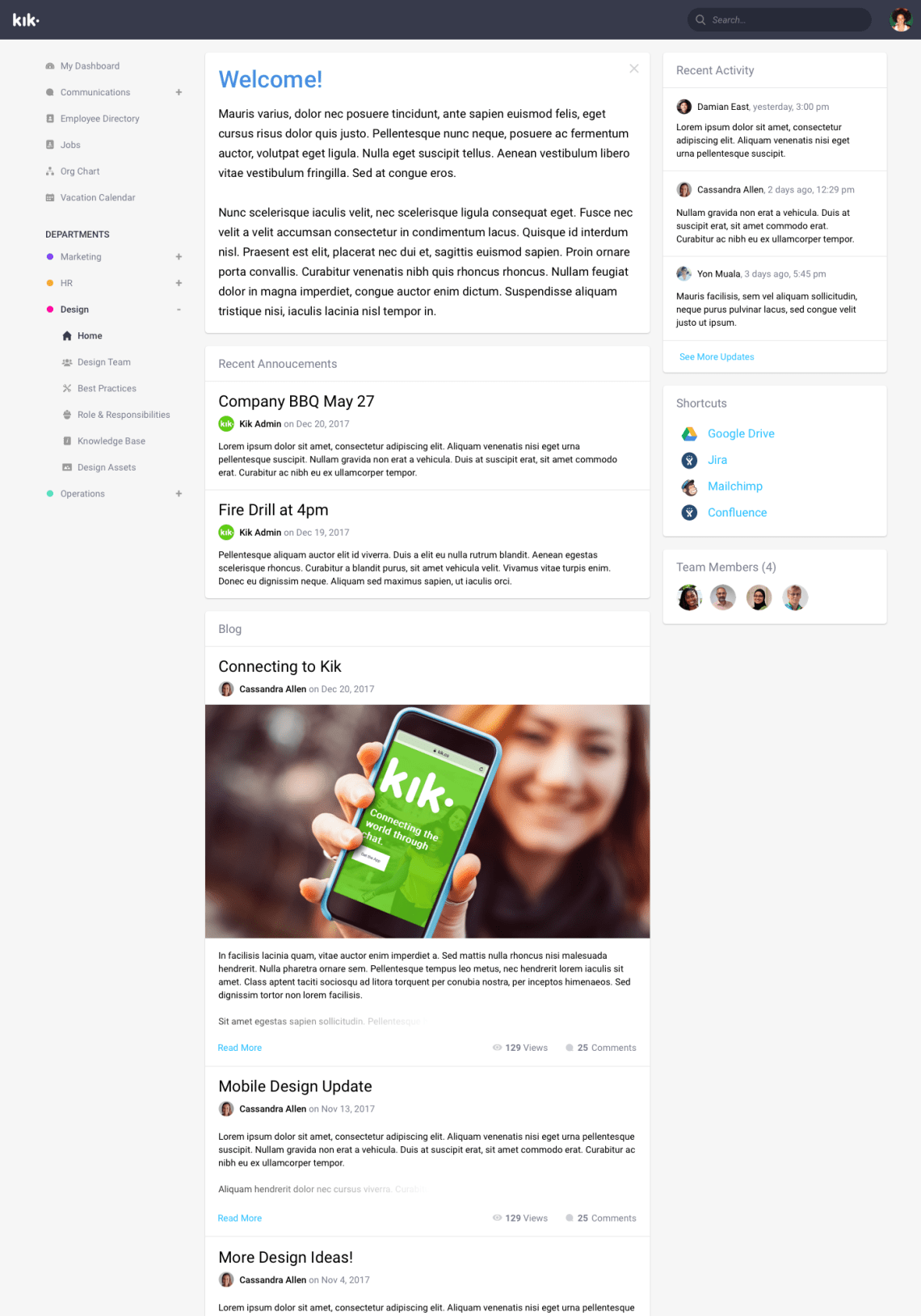
Department indicators by color
To inform users which department a piece of information was from, we gave each announcement or blog post a colored circle that represented a specific department. Also, this design idea was used in the main menu (which doubled as a legend), showing the department color indicator next to the department name.
The Design
We started making wireframes for the most important pages, dashboard, department homepage, blog posts, employee directory, etc…). We laid out all the features and the interface characteristics of each page.

Final Designs